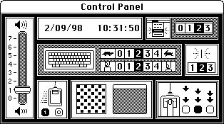
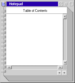
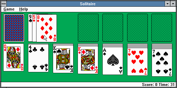


In 1983, Susan took a job at Apple to develop an iconographic and typographic system for the first Macintosh computer. The icons were the first of their kind, using simplified images from the non-digital world as the basis for the visual language. Typefaces like Chicago, Geneva, and Cairo utilized every pixel they could to create a something legible and friendly. In tandem with the standalone assets, she also worked to develop several window designs including the Macintosh control panel. The control panel continues her trend of depicting real objects in a virtual space. Positioned alongside settings such as volume are directions for how to best utilize the computer mouse, a relatively new concept at the time.


IBM Warp OS/2 was an operating system created through a collaboration from Microsoft and IBM. It featured a basic color palette to work alongside the more primitive display technology of the late 80s. Although a majority of the software was designed in-house, they did look to Kare to expand their iconographic system in 1989. This collection of icons made the most of the colors available. Susan leaned heavily into a CMYK scheme to create these vibrant system representations.


With the launch of Windows 3.0, Kare introduced a lot of assets that would be used by Microsoft for years to come. Her icon system used the slightly increased resolution to create a 3D representation of real-world objects, including their shadows. She also created an extremely detailed set of playing cards for the first Microsoft Solitaire game including multiple back designs. The game itself had an interface additionally designed by Kare. She would design the top navigation for multiple windows including the Windows 3.0 control panel. To complete her contribution to this operating system, she worked on a series of desktop wallpapers to be placed behind windows and icons. The tapestry wallpaper on display here is an example of just how far she would go to use every pixel the screen technology has to offer. The end result is an incredibly detailed detailed design that rivals any handwoven, artisan-created tapestry.


Chumby was the first of its kind for a smart timekeeping device. The original product released by Chumby, chumby One, was a small, freestanding, tablet-sized tool for engaging with the internet and other assorted tasks. She was hired to develop the company's entire brand system. This included the quirky Chumby logo and mascot, fitted to the limited resolution of the device, as well as Chumby's marketing effort and their entire website design.


Between 2006 and 2010, Kare worked on a series of emoji-like icons called Facebook Gifts. Gifts are a now defunct feature on Facebook wherein users would pay $1 to have a "gift" appear on their friend's profile. The feaure has been compared to "poking" as an early experiment to test how users interact on social media. Kare's icons took full advantage of a 64x64 grid, creating almost true-to-life depictions of objects with various subjects. They utilize gradients and a wide color spectrum to properly show light and shadows as well as create tangible textures. From rubber ducks to Sweethearts, the icons pop off the page with vibrant colors and friendly designs. Within the collection, there is an icon for any occasion.


In 2013, WeatherBug launched their official app for the iOS App Store. The iconographic system displaying numerous different weather conditions was created by Kare. Unlike many of her other icons, these utilize gradients to create a more natural bitmap image. Becuase of her contributions and the general UI, this app won the Appy App of the Year award in 2013.


The Path Social Network app hired Kare to create two icon packs: Iconic Food and Iconic Travel. The packs would be a one-time purchase in which users could send them in direct message conversations with their network. Despite the comparatively large resolution of the iPhone, Kare returned to the basics to create a set of adorable, colorful, 8-bit images with famous places and cuisines.


In 2015, Pinterest hired Kare as a creative director, a shift from her work mostly being client-driven up until this point. She created a clean set of icons for a company rebrand. Some of these icons depict priorities of the service such as privacy. She also established the visual system behind "The Point" Cafe, a cafe located in the Pinterest headquarters. It had a related but separate series of assets that would be used on everything from the displays to merchandise. One piece of merchandise was a sticker showing a pin with a smile on it, created by Kare. This harkens back to a similar Mac icon from the 80s.